- Published on
Use tailwindcss turncate to hidden overflow text
- Authors

- Name
- Azimuth
Overview
To achieve a single-line text truncation with an ellipsis (...) in a flex row layout when the text exceeds the child element's space, you can use CSS properties like text-overflow, white-space, and overflow. Below, I'll explain how to implement this in the context of the existing Next.js + Tailwind CSS project.
要在文本超过子元素的空间时,在弹性行布局中使用省略号 (...) 实现单行文本截断,您可以使用 text-overflow、white-space 和 overflow 等 CSS 属性。下面,我将解释如何在现有 Next.js + Tailwind CSS 项目的上下文中实现这一点。
Solution To truncate text in a flex child element:
解决方案要截断 Flex 子元素中的文本,请执行以下作:
Set text-overflow: ellipsis to display ... when text overflows.
将 text-overflow: 省略号设置为显示 ...当文本溢出时。
Set white-space: nowrap to prevent text from wrapping to multiple lines.
设置 white-space: nowrap 以防止文本换行为多行。
Set overflow: hidden to hide any content that exceeds the element's boundaries.
设置 overflow: hidden 以隐藏超出元素边界的任何内容。
Ensure the parent (flex container) and child elements have defined widths or constraints to trigger overflow.
确保父元素(弹性容器)和子元素已定义宽度或约束以触发溢出。
The truncate class in Tailwind CSS applies:
.truncate {
  overflow: hidden;
  text-overflow: ellipsis;
  white-space: nowrap;
}
1、Below is the nextjs snippet with text truncation applied to the link list:
//...

const tools = [
  {
    name: 'Lorem ipsum dolor sit amet consectetur adipisicing elit. Maxime ducimus omnis, laborum enim, dolorem ',
    description:
      ' Maxime ducimus omnis, laborum enim, dolorem fugit vel aut ratione quis accusamus mollitia iusto exercitationem hic veniam debitis, vitae odit excepturi. Eveniet.',
    url: '#',
    icon: 'https://github.githubassets.com/favicons/favicon.svg', // Placeholder icon
  },
  {
    name: 'tool 2',
    description: 'another tool simple',
    url: '#',
    icon: 'https://github.githubassets.com/favicons/favicon.svg',
  },
  {
    name: 'tool 2',
    description: 'another tool simple',
    url: '#',
    icon: 'https://github.githubassets.com/favicons/favicon.svg',
  },
]

// ...

<main className="mx-auto max-w-7xl px-4 py-8 sm:px-6 lg:px-8">
  <div className="grid grid-cols-1 gap-6 sm:grid-cols-2 lg:grid-cols-3">
    {tools.map((tool, index) => (
      <Link href={tool.url} key={index}>
        <div className="flex flex-col rounded-lg bg-white p-6 shadow-md transition-shadow duration-200 hover:shadow-lg dark:bg-gray-800">
          <h2 className="truncate text-xl font-semibold text-gray-900 dark:text-white">
            {tool.name}
          </h2>
          <p className="mt-2 truncate text-gray-600 dark:text-gray-300">{tool.description}</p>
        </div>
      </Link>
    ))}
  </div>
</main>
it looks well.
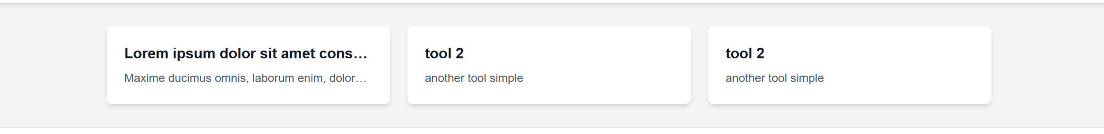
2、Now To enhance the page by adding a 40x40 icon to the left of the text in each tool card, we need to adjust the flex layout and styling.
Below is the optimized nextjs snippet
<main className="mx-auto max-w-7xl px-4 py-8 sm:px-6 lg:px-8">
   <div className="grid grid-cols-1 gap-6 sm:grid-cols-2 lg:grid-cols-3">
      {tools.map((tool, index) => (
      <Link href={tool.url} key={index}>
         <div className="flex flex-row items-center rounded-lg bg-white p-6 shadow-md transition-shadow duration-200 hover:shadow-lg dark:bg-gray-800">
            <Image
            src={tool.icon}
            alt={`${tool.name} icon`}
            width={40}
            height={40}
            className="mr-4 h-10 w-10 flex-shrink-0 object-cover"
             //   Added flex-shrink-0 to the <img> to prevent the icon from shrinking, ensuring it stays 40x40 pixels regardless of text length.
            />

            <div className="flex flex-1 flex-col">
            <h2 className="truncate text-xl font-semibold text-gray-900 dark:text-white">
               {tool.name}
            </h2>
            <p className="mt-2 truncate text-gray-600 dark:text-gray-300">
               {tool.description}
            </p>
            </div>
         </div>
      </Link>
      ))}
   </div>
</main>
But, Not very well. The long text overflowed...
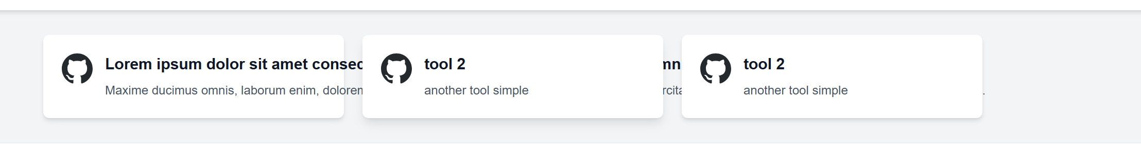
Now how to salve it?
Problem: The text overflows the card because the truncate class alone may not constrain the text adequately when the flex container's width is dynamically adjusted by the grid or screen size.
问题 :文本会溢出卡片,因为当 Flex 容器的宽度由网格或屏幕大小动态调整时,单独的 truncate 类可能无法充分约束文本。
Desired: Limit the text to a single line with an ellipsis, ensuring it stays within the card's width, while keeping the 40x40 icon aligned vertically with the title and description.
所需 :将文本限制为带有省略号的单行,确保其保持在卡片的宽度范围内,同时保持 40x40 图标与标题和描述垂直对齐。
Optimization Plan
Explicit Width Constraint: Add a maximum width to the text container to enforce truncation, ensuring it doesn't expand beyond the card.
显式宽度约束 :向文本容器添加最大宽度以强制截断,确保它不会扩展到卡片之外。
Improved Flex Layout: Use
flex-shrinkto allow the text to shrink while prioritizing the icon's fixed size.改进的 Flex 布局 :使用 flex-shrink 允许文本收缩,同时优先考虑图标的固定大小。
Consistent Truncation: Apply
truncatewith a defined width or flex basis to guarantee overflow handling.一致截断 :应用具有定义宽度或 flex 基础的截断 ,以保证溢出处理。
Updated snippet Code
The
min-w-0to the text<div>to allow it to shrink below its content's minimum width, enabling truncation when the card is narrow.将
min-w-0设置为文本<div>,以允许其缩小到其内容的最小宽度以下,从而在卡片较窄时启用截断。The
flex-1to let the text take available space, but min-w-0 ensures it can shrink, preventing overflow.flex-1让文本占用可用空间,但min-w-0确保它可以缩小,防止溢出。
<main className="mx-auto max-w-7xl px-4 py-8 sm:px-6 lg:px-8">
  <div className="grid grid-cols-1 gap-6 sm:grid-cols-2 lg:grid-cols-3">
    {tools.map((tool, index) => (
      <Link href={tool.url} key={index}>
        <div className="flex flex-row items-center rounded-lg bg-white p-6 shadow-md transition-shadow duration-200 hover:shadow-lg dark:bg-gray-800">
          <Image
            src={tool.icon}
            alt={`${tool.name} icon`}
            width={40}
            height={40}
            className="mr-4 h-10 w-10 flex-shrink-0 object-cover"
            //   Added flex-shrink-0 to the <img> to prevent the icon from shrinking, ensuring it stays 40x40 pixels regardless of text length.
          />
          // add min-w-0 and flex-1
          <div className="flex min-w-0 flex-1 flex-col">
            <h2 className="truncate text-xl font-semibold text-gray-900 dark:text-white">
              {tool.name}
            </h2>
            <p className="mt-2 truncate text-gray-600 dark:text-gray-300">{tool.description}</p>
          </div>
        </div>
      </Link>
    ))}
  </div>
</main>
Why It Works?
In a flex container, each flex item has a default minimum width based on its content (e.g., the natural width of the text). When the text is long and the container's available width is reduced (e.g., due to a narrow screen or grid layout), the flex item resists shrinking below this default minimum width. This behavior is governed by the CSS specification, where a flex item's min-width defaults to auto (or min-content in some cases), meaning it will try to accommodate its content's intrinsic size.
在 Flex 容器中,每个 Flex 项都有一个基于其内容的默认最小宽度(例如,文本的自然宽度)。当文本很长并且容器的可用宽度减小时(例如,由于屏幕或网格布局较窄),Flex 项会抵制缩小到低于此默认最小宽度。此行为受 CSS 规范的约束,其中 Flex 项的 min-width 默认为 auto(或在某些情况下为 min-content),这意味着它将尝试适应其内容的内部大小。
The min-w-0 on the text container allows it to shrink below its natural width, triggering truncate when the text exceeds the available space. Without min-w-0, flex items default to a minimum width based on content, causing overflow.This is a common fix in flex layouts where content-driven minimum widths cause overflow issues.
文本容器上的 min-w-0 允许它缩小到低于其自然宽度,从而在文本超过可用空间时触发截断 。如果没有 min-w-0,flex 项目默认为基于内容的最小宽度,从而导致溢出。这是 Flex 布局中的常见修复方法,其中内容驱动的最小宽度会导致溢出问题。
Technical Details
In the previous layout:
- The card (
<div>) is a flex container withflex flex-row items-center. - The text container (
<div className="flex-1 flex flex-col">) is a flex item that takes the remaining space withflex-1. - The icon is fixed at 40x40 pixels with
w-10 h-10. - The text (title + description) has
truncate, which appliesoverflow: hidden,text-overflow: ellipsis, andwhite-space: nowrap.
Problem
Without min-w-0, the text container's default min-width: auto causes it to maintain a width based on the full length of the text. When the card's total width (icon + text) exceeds the parent grid's column width, the text overflows because:
- The text container refuses to shrink below its content's natural width.
- The
flex-1property tries to distribute remaining space, but it can't override themin-width: autoconstraint. - The
truncateclass alone isn't enough because it only works if the element's width is explicitly constrained or allowed to shrink.
Optimization
Adding min-w-0 (or min-width: 0 in raw CSS) explicitly sets the text container's minimum width to 0 pixels. This overrides the default min-width: auto and allows the flex item to shrink as much as needed, even below the natural width of its content. Here's how it works:
Shrinking Flexibility:
- With
min-w-0, the text container can collapse to 0 width if necessary, enabling it to fit within the card's constrained space. - Combined with
flex-1, it takes up the remaining space after the icon (40px + margin) but can shrink when the card width is limited.
- With
Truncation Trigger:
- The
truncateclass (overflow: hidden,text-overflow: ellipsis,white-space: nowrap) now takes effect because the text container has a defined width (determined by the flex layout and grid constraints). - When the text exceeds this width, it is hidden, and the ellipsis (
...) appears, preventing overflow.
- The
Interaction with Flex Layout:
- The icon's
flex-shrink-0ensures it stays at 40x40 pixels. - The text container's
min-w-0allows it to shrink, andflex-1distributes the remaining space, creating a balanced layout. - The
items-centeralignment keeps the icon vertically centered with the truncated text.
- The icon's